Decoding Design Series: Breaking Down the Consultation
We start every project with an onsite consultation. It is a working meeting with both Lauren and I, and it is a big picture look at the project and a debrief of what the client is looking to achieve, or, what we call “scope.”
The consultation is one of my favorite parts of my work. It is the first in-person meeting with the potential client and our first eyes on the house itself. I like that we go in relatively cold, so it is a very visual experience and really exciting to see what all needs to be addressed. I sometimes feel like a design detective; putting together what we see, what the client sees and trying to figure out just where we are all going.
Every client and every house is unique, but there is a thread of consistency that runs through these meetings. Here is a short list of what we often see when we are looking at a home to renovate:
The Proper Entry
Often we pull up to a house and don’t quite know where we should park or, for that matter, where we are supposed to enter. The hallmark of good curb appeal is a proper entry and a natural flow to the front door.
Architecture
We run into homes that have a lack of architecture or have dramatically dated architectural detail. This we call “a moment in time.”
Here are a few examples of the most glaring issues:
A lack of good woodwork. Adding good woodwork such as a tall baseboard or detailed window casing, wall or ceiling treatments such as shiplap, wainscot or beams can go a long way to adding architectural detail to a house that is lacking some interest.
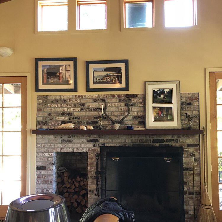
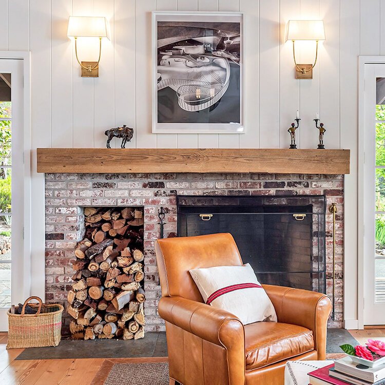
Dated or underdressed fireplaces. We see many fireplaces that are dressed in a skimpy manner; meaning that the mantle is uninspiring or not to scale and typically there is a small surround surface, often with natural brick or tile, that is too small in scale for the wall or space it is in.
Below is a good example of how adding a wall treatment of painted plank, scaling back the size of the fireplace, and incorporating a larger, heavier mantle can dramatically change the look of a space…
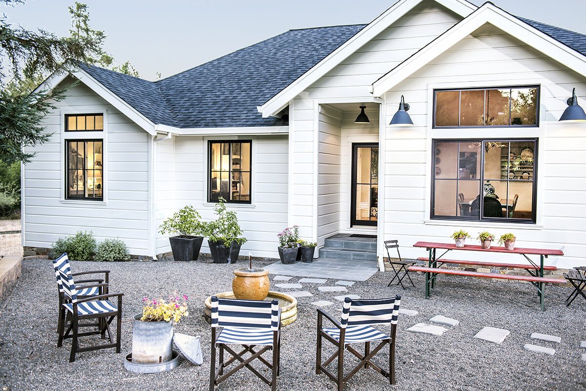
Dated windows. Dated windows on a house can dramatically set the tone for the whole house, such as the dreaded arched transom window. We recommend squaring them our for a more classic design. I cannot stress just what a difference this can make for the overall architecture of a home.
We also recommend investing in good quality windows. Often, clients struggle when looking at the budget number between vinyl and fiberglass/wood options. But for us windows are architecture and they are not a place to skimp. A window with a wood interior is worth it’s weight in gold for adding to the homes overall architectural look and feel.
This is a great example of how removing a dated window shape and style can update the exterior of a home…
Materials and Finishes
One of the key elements of good design is the push and pull of repetition, interest and layers.
We all too often see a variety of materials with no foundational axis or an awkward mix of styles. This can easily occur when projects are taken on individually and with no big picture planning in mind. The solution to this is to work towards a singular design focus for the project and reign in that which does not fit with your personality or that of the home.
On the flipside of that, we see a lot of newer or subdivision style homes with over repetition. An example of this is the matching material or identical finishes everywhere.
We like to mix and match materials and finishes but also add interest with repetition, often used in varied applications. You can use the same tile, but maybe the floors in one bathroom are set in a herringbone pattern and a brick or running bond pattern on the shower walls in another.
I really hope that breaking this down helps you look at your home in a different way and maybe see a little of what we see when we are invited in for a renovation consultation. I love thinking about what is the same because I am often focused on each client as being so different. Next time, I will take a look at what we look for when we step inside to address a furnishing project.
Happy 2021. Cheers to a year with a bit more ease and grace.
Tama


