Harrison House Remodel
Photo by Chris Stark
Our house was originally built in 1989. The story goes that a contractor built it as a spec home and lived in it for five years, sold it to the next owner who also stayed for 5 years and then sold it to us. When we bought it, it was the stereo-typical late eighties vision of pale gray and mauve. The mauve was in many formats: counters, carpet, tile even mauve floral on tile. It was truly something.
Pretty…ugly right?
We have touched and replaced every surface at least once since 1998. The gallons of paint that we have used, my husband jokes, has reduced our interior square footage. He may be right.
Like our clients, Covid had me itching to do a few updates. I wanted to add a bit more character to the paler canvas that we had been living with. I started in the master bedroom, adding a focal point with Lewis & Wood wallpaper on the headboard wall, which became the jumping off point for the room design.
I’ve been drawn more recently to warm tones and the Pomegranate wallpaper in charcoal reads like a rich, warm brown with bits of mustard highlights. It’s a big print and I love it. Lewis & Wood is an incredible UK company specializing in papers and fabrics. Among many of the things that I love about them, is that they have fabrics that match their wallpapers. I have 2 narrower casement windows on the wall and I wanted to treat them with flat roman shades but I wanted the print to be seamless. When the romans are closed it looks solid. It is really fun.
Photo by Chris Stark
I added a darker, brown sisal rug, a bright, white linen bed and used my existing mis-matched English pine pieces on either side as nightstands. A pair of fun lamps, neutral drapery with a mustard brush fringe leading edge and we were off to the races.
In the living area, it was time for a bit more of an update. The fireplace was original and was an ugly cultured stone. It desperately needed a face lift and some additional layers. I decided to add v-groove vertical paneling to the fireplace wall, added some fabulous spring green scallop sconces from Nickey Kehoe and selected a more appropriate stone and traditional mantle to finish it all off.
Before, woah…throwback to some heavy, rolled arm sofas…not my best work.
And after, so much better.
Photo by Chris Stark
Mocking up the new mantle.
Photo by Chris Stark
This may be my current favorite sconce. Love me a bit of spring green!
Photo by Chris Stark
I decided to paint the family room walls and ceilings all in Revere Pewter to make it a tad moodier.
Photo by Chris Stark
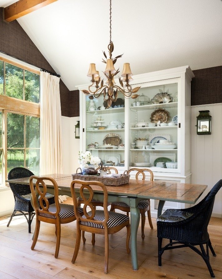
The last piece was paneling the dining room wall with a tall wainscot up to about 80 inches and adding a dark, chocolate brown textural raffia weave wallpaper above.
Photo by Chris Stark
Photo by Chris Stark
And just for fun a little kitchen before and after. Who thought so much oak and mauve was a good thing?
Photo by Chris Stark
Not sure if I am done for good, but I am for now. It was fun to reserve a little of my design time for my own project. Cheers to you working on yours.


