Sonoma Contemporary Cottage Project Story
This project in the town of Sonoma just makes me happy.
Our client purchased a vintage, 100 year old cottage with lots of character in the middle of the pandemic, as an escape from the City. The house needed a refresh and full furnishings inside and out. She wanted to be able to entertain friends and family in a space that was beautiful, functional but with materials that would hold up, and wanted to add color and make the spaces feel clean, fun and warm.
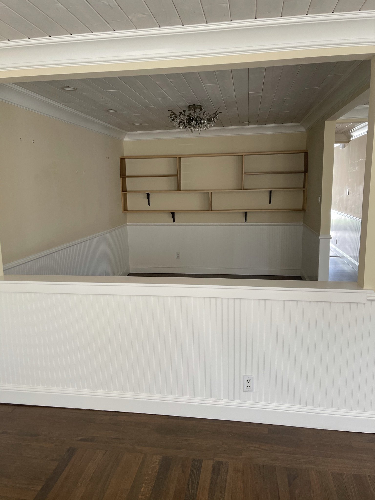
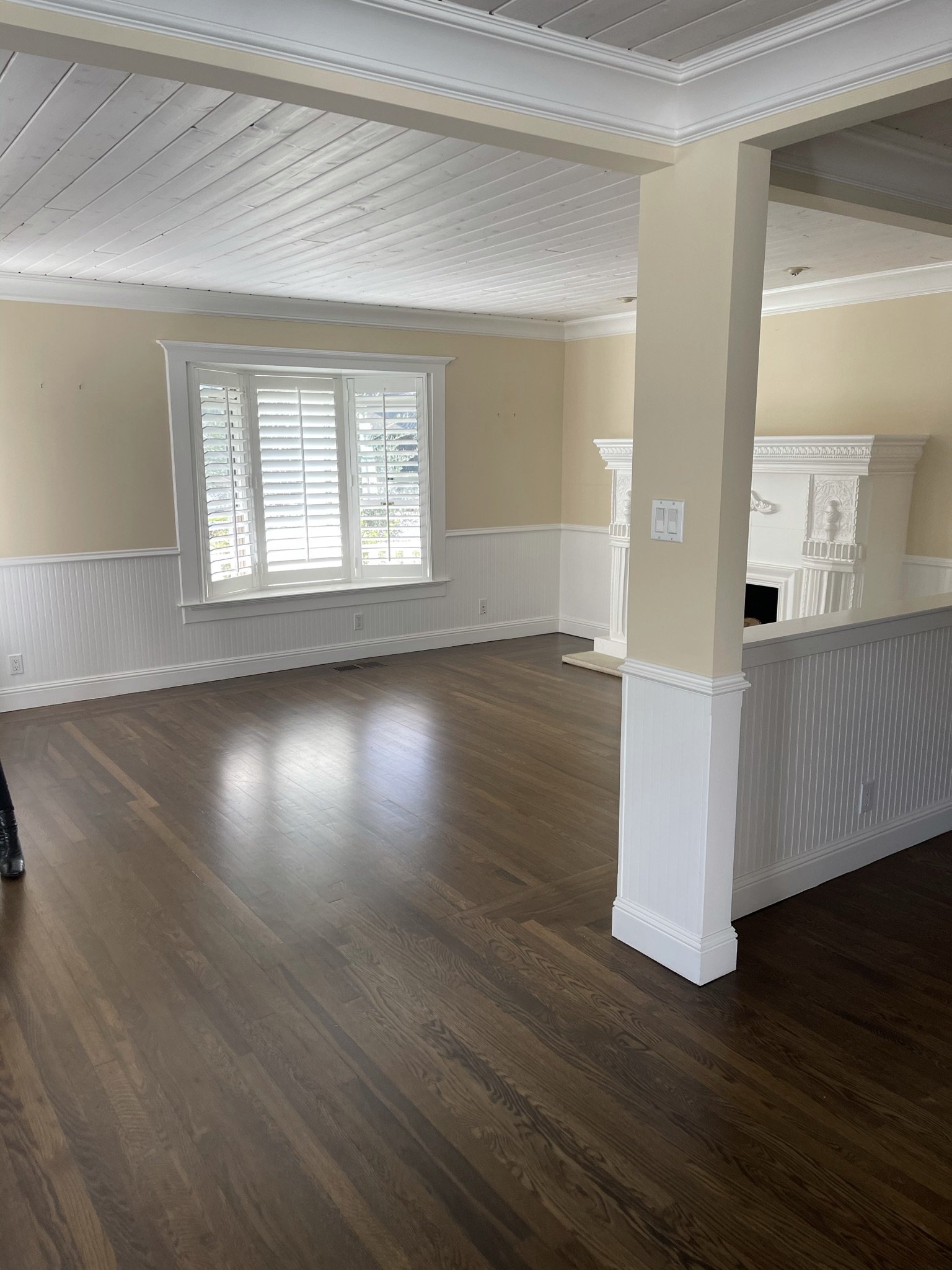
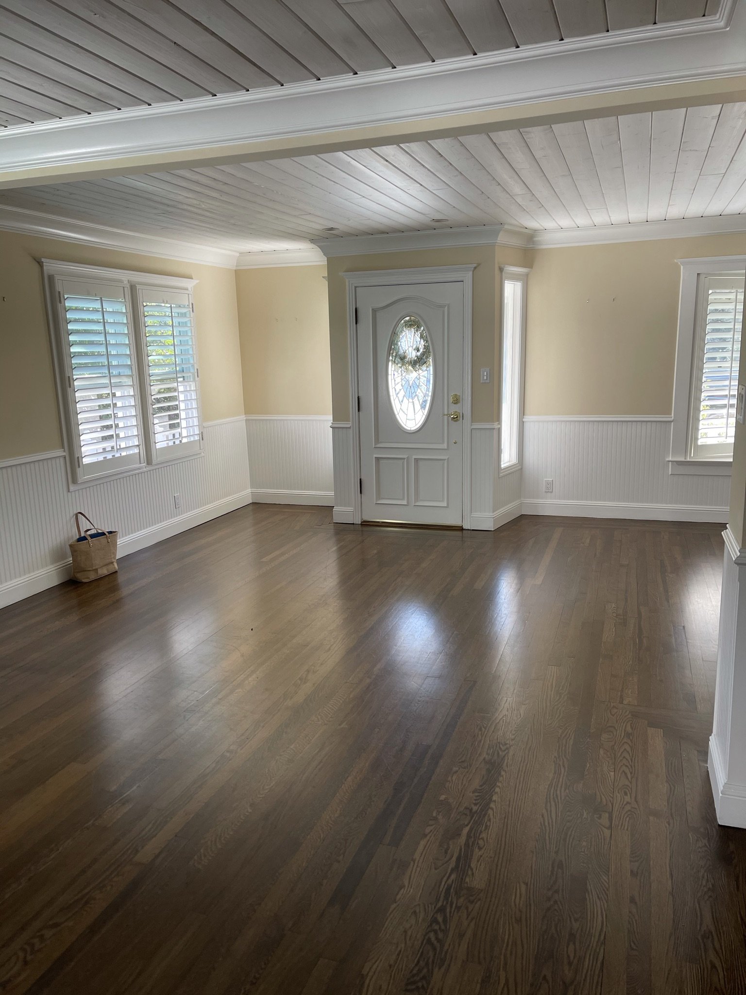
The first thing that we noticed on the walk-through was the vast amount of low wainscoting that crept along both the first and second levels. While at first glance, you might think “what is wrong with it?” We felt that the quality and the height didn’t add to the charm but made the space feel chopped up and awkward.
The ceiling, while white, was a bit rustic which made it feel heavy and quite honestly a little oppressive.
We started with removing the pony wall at the dining room and the wainscot from the main level. We felt like it worked as an architectural element in the upstairs rooms, so we left it there. The contractor found, to all our delight, that the ceiling in the front rooms was dropped and was able to open that up and remove the planking which dramatically changed the feeling of space and light in the front.
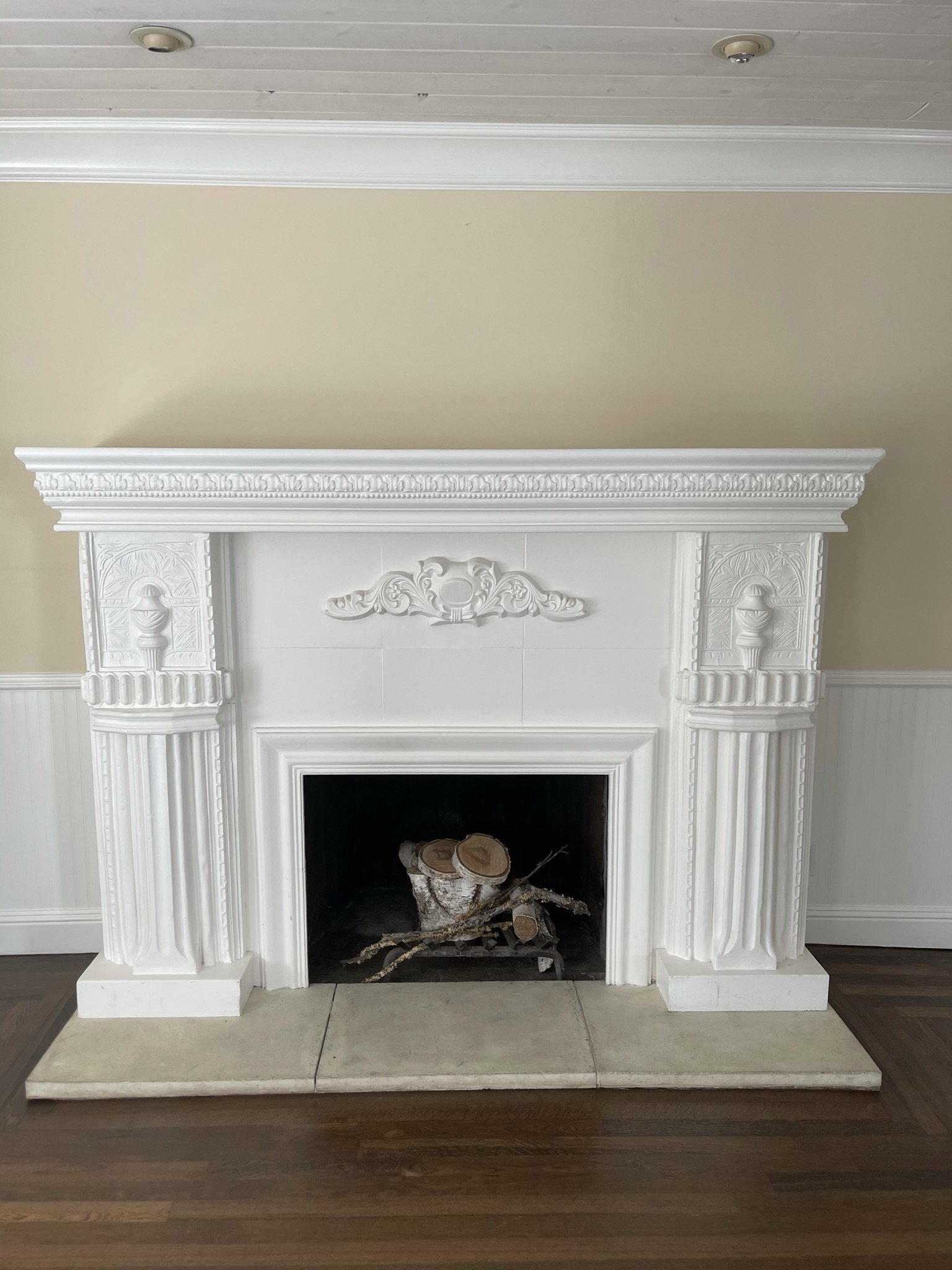
We removed the center fussy element from the fireplace. We wanted to retain what appeared to be vintage/original.
Basically, cleaned it up and painted it a warmer white, to stand out a bit but feel original. We love how it turned out. It is just such a fun, happy house.
The dining room gained a little breathing room with the elimination of the pony wall. We replaced the DIY shelving wall unit with this built-in ebonized oak dining cabinet. It is simple and contemporary but makes such a statement. The dining table is a one-of-a-kind 1960 Italian piece which is both light and weighted in the space. It is a combination of glass, metal and marble. Truly a special piece. The chairs are custom in a fun, blue performance animal print. Still, my most favorite chairs!
This room speaks so perfectly of the balance of old and new, elegant and fun.
A small sitting area at the entry, off the living room and dining room which gets some beautiful, dappled light. Perfect for an afternoon book and a cup of tea.
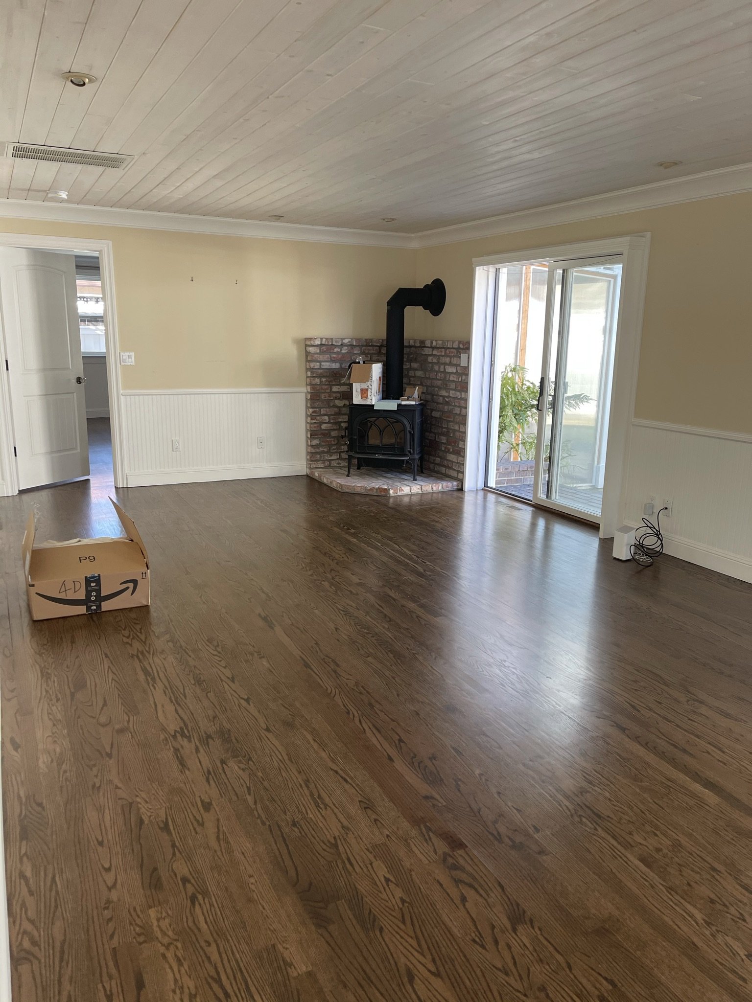
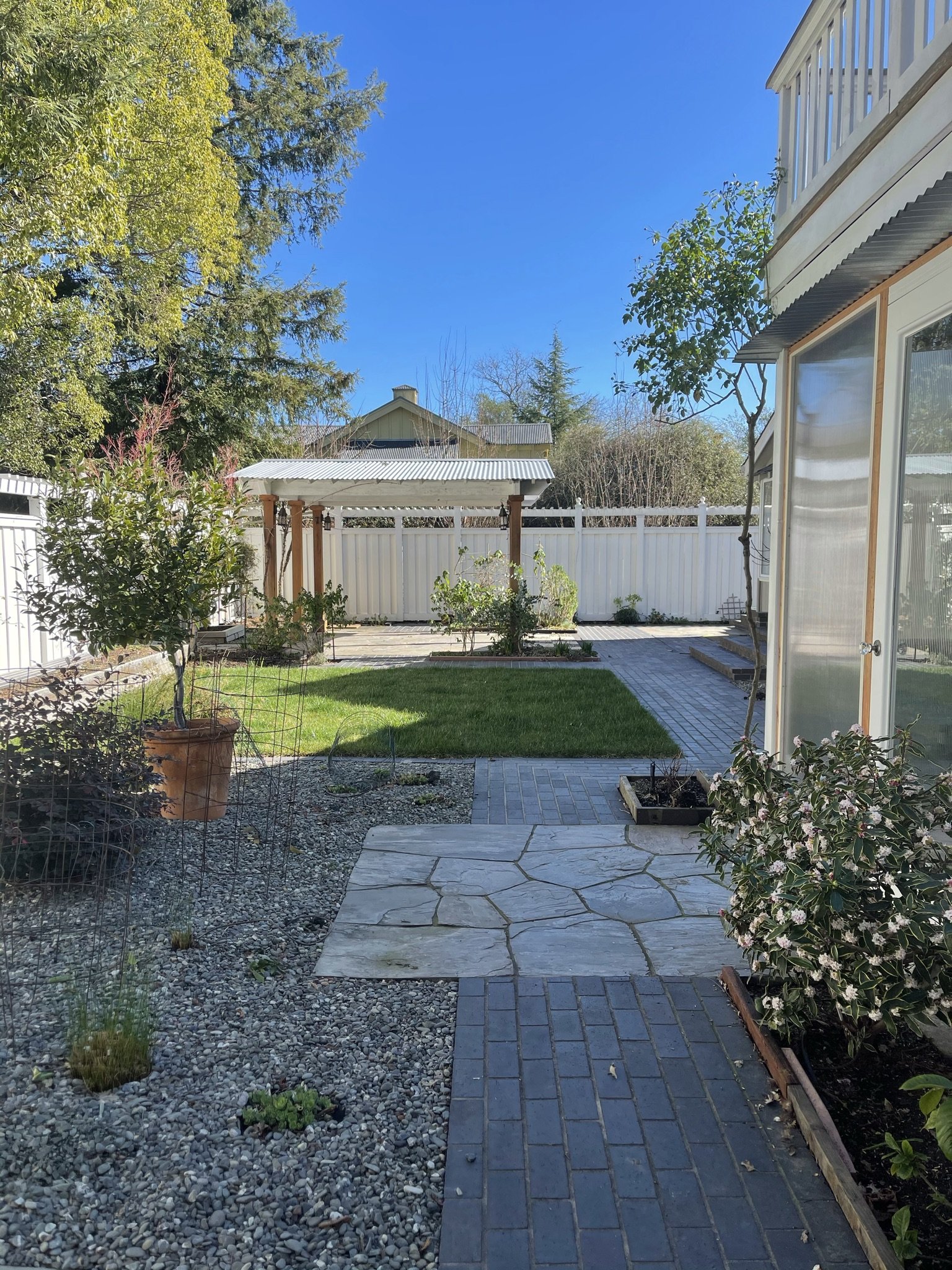
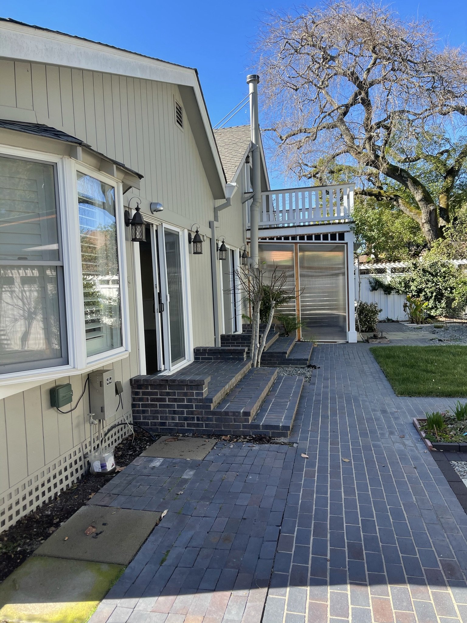
Here is the family room and backyard before. We removed the low wall treatment, cleaned up the board joints and painted the ceilings a high gloss, warm white. The sheen completely transformed them.We said goodbye to the wood stove and gained more room for swivel chairs for entertaining.
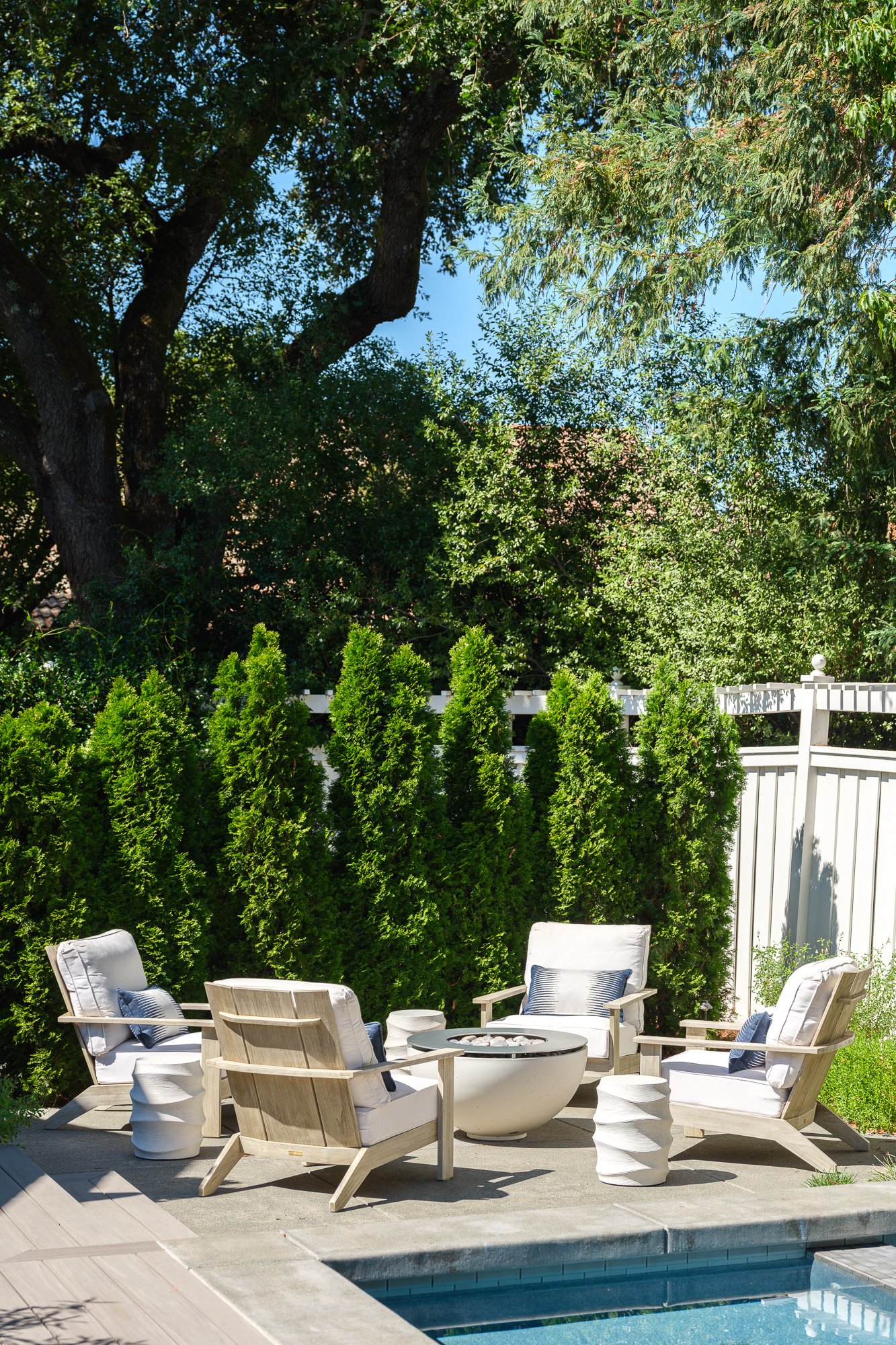
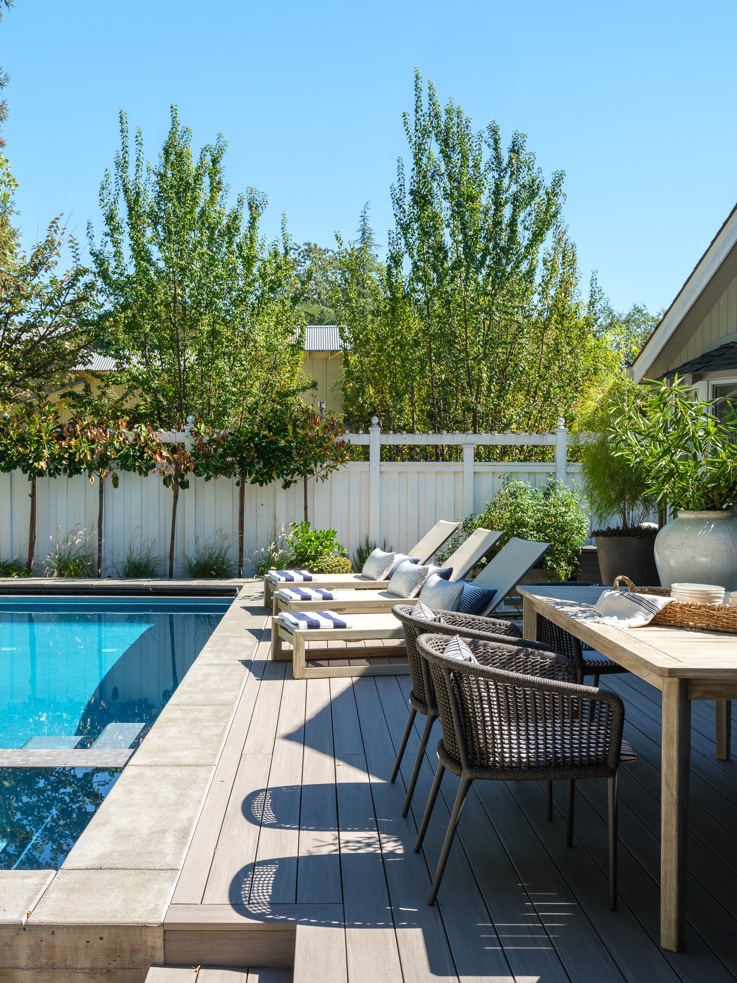
The patio before our friends at Rozanski Design got their hands on it. A new deck, pool and firepit addedmore indoor/outdoor living.
Look at those ceilings.
A little dining alfresco, anyone?
We added a bit of fun color to the powder bath with a chunky green grass cloth.
The master got it’s own bit of wallpaper on the headboard wall, along with a neutral patterned rug that calmed the space. I love the punch of glue in an otherwise calm aesthetic.
Heading upstairs, we had two guest rooms that needed a little attention too. A little paint, a little paper and a lot of furnishings finished it off.
It is amazing what paper can do to a room with a more complicated ceiling. It turns awkward into quirky and charming. Paper can fix a lot of sins and adds color, pattern and drama. This pattern, did all those things and created a really cozy space for guests.
And this room, well it’s just color and pattern on repeat. Again, we had a bit of a challenge with wall heights and furnishing placement restrictions. We chose to wallpaper the headboard wall to create a finished end and then layered it up with color, pattern and texture. An old deck was removed and a new double casement window replaced the door.
That’s our house tour of this happy house. I hope that you found something to take away from this vintage cottage. We sure did! View the final portfolio page of this project here.

